
Overview
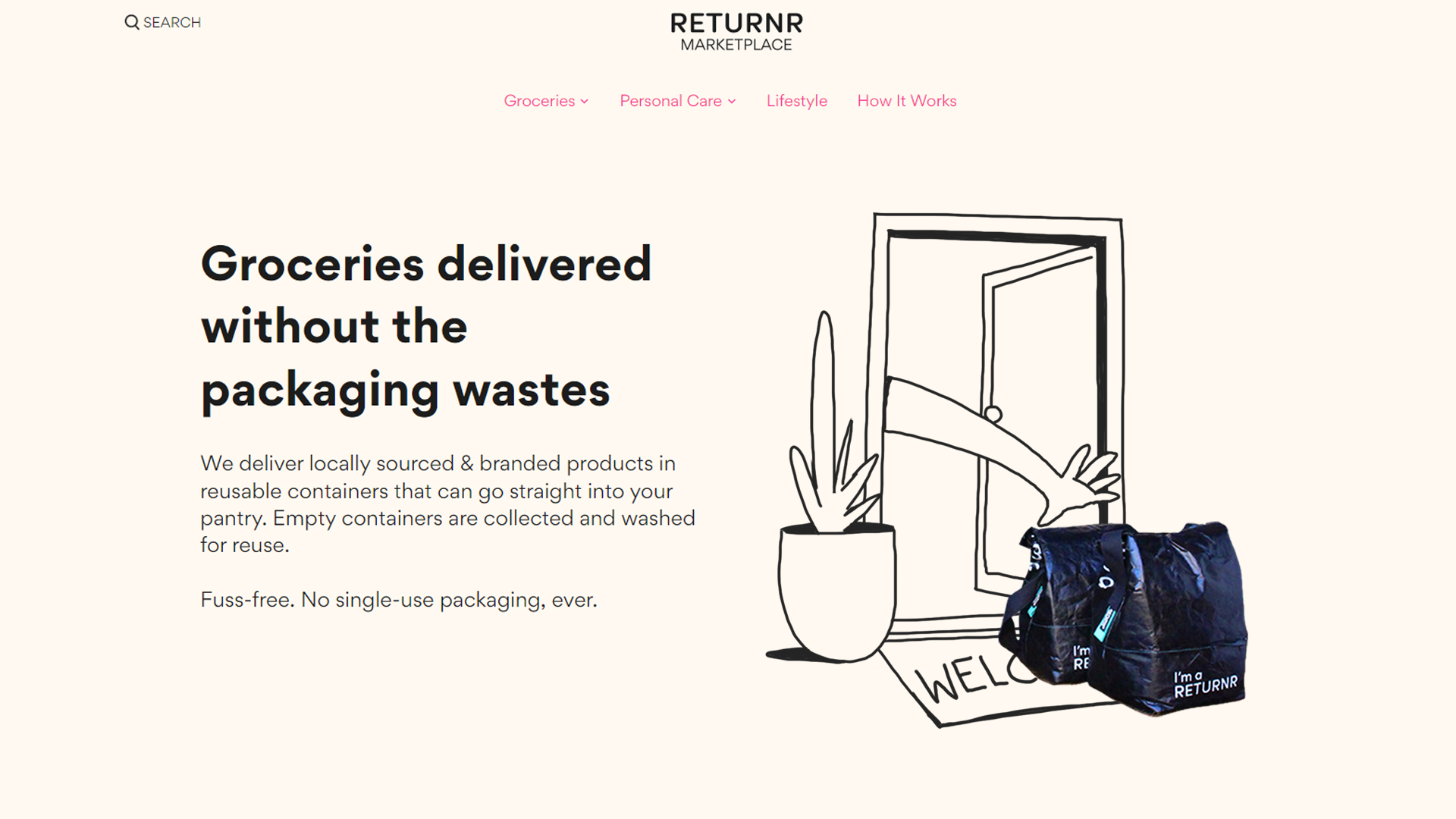
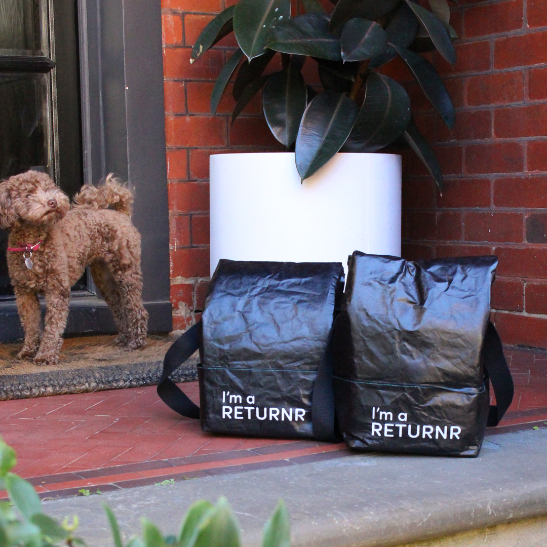
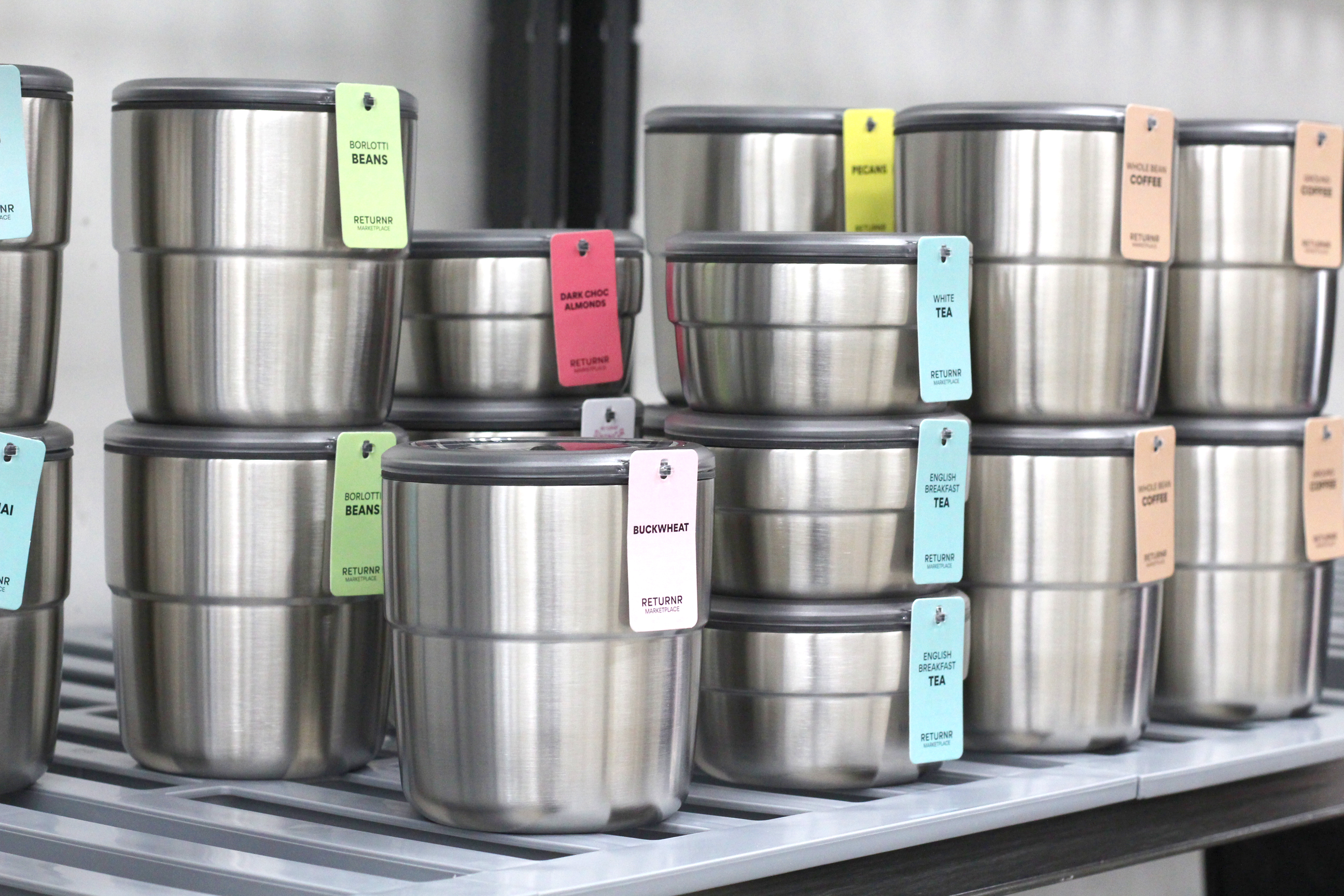
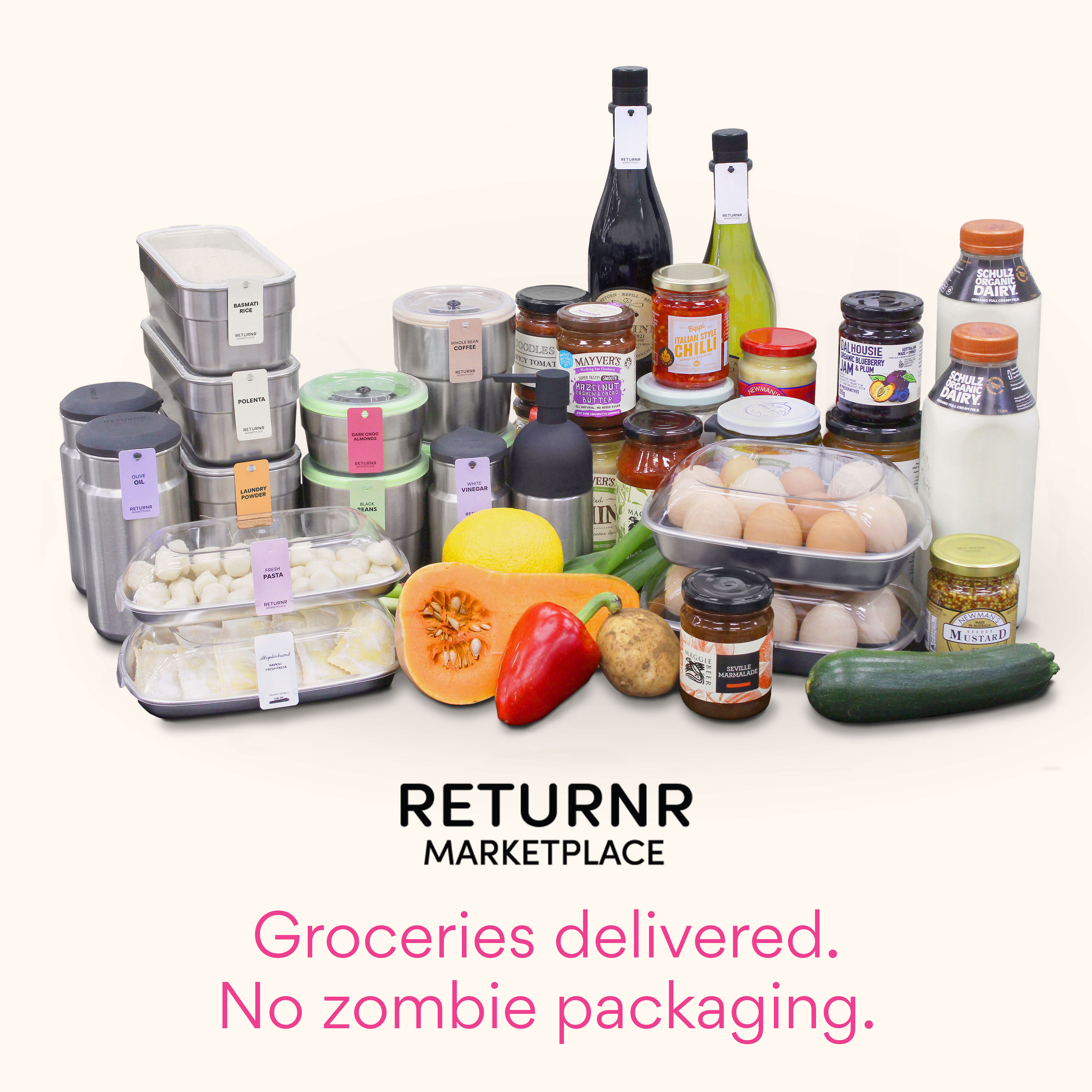
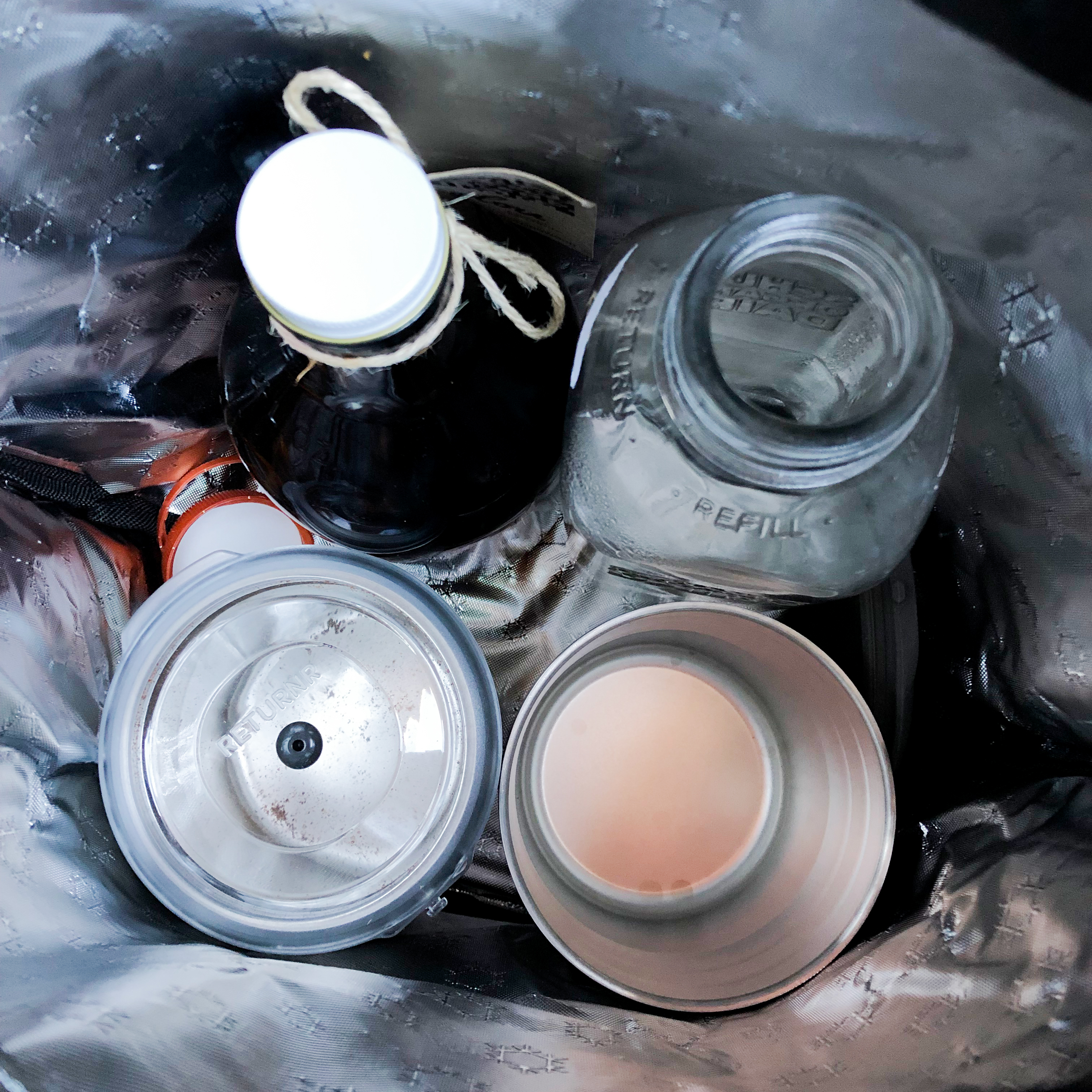
Returnr Marketplace is Australia’s first zero-waste online supermarket. Delivering hundreds of grocery items in reusable packaging that are collected, washed and refilled. This is a members-only service operating with a 100% commitment to zero waste.
The challenge
Design & build a Shopify website for customers to shop for zero-waste groceries. With over 150 products, the website must clearly communicate how the service works, especially around how packaging can be returned for reuse.
My role
As a Product Designer, I was responsible for end-to-end development, including mapping user flows, crafting prototypes & shaping the brand.
Pre-launch, my goal was designing the customer experience from first impression, sign up to placing their first order.
Post-launch, I shifted focus to shaping the brand through iterative website refinement, as well as improving navigation on the home page catalog.
I was also heavily involved in production stages, where I managed the Shopify back-end, collaborated with internal stakeholders to sync product databases to the store, and worked closely with developers to build custom functions.
Achievement
- $500,000 funding from Sustainability Victoria
- Good Design Award Winner 2022 (Service Design)
- Designers Australia Award 2022 – Award of Merit
- Victorian Premier’s Design Award 2021 – Finalist (Service Design)
My contribution
- User flow mapping
- Wireframes & prototypes
- Visual design & branding
- E-commerce store design
- Developer liaison
Team
- 1 x Co-founder
- 1 x Product Manager
- 2 x Visual Designers
- 2 x Front-end Developers
Deliverables
- Fully functional Shopify store
- Asset packs including product renders, icons & illustrations

0 to launch: a steep learning curve
This was my first service / digital design project, so the first thing I did was learning everything I could about UX/UI, Shopify and even a bit of coding. I also helped expand the team’s capabilities in digital design by training team members.
The MVP plan was to launch with a small collection, to communicate how the service works and to set up basic functions like members-only purchase while still allowing visitors to browse products. During this phase, I learned the basics of setting up a Shopify store, building landing pages and working with custom apps and plugins.
After 5 months, the first MVP was up and running. Returnr Marketplace was launched.
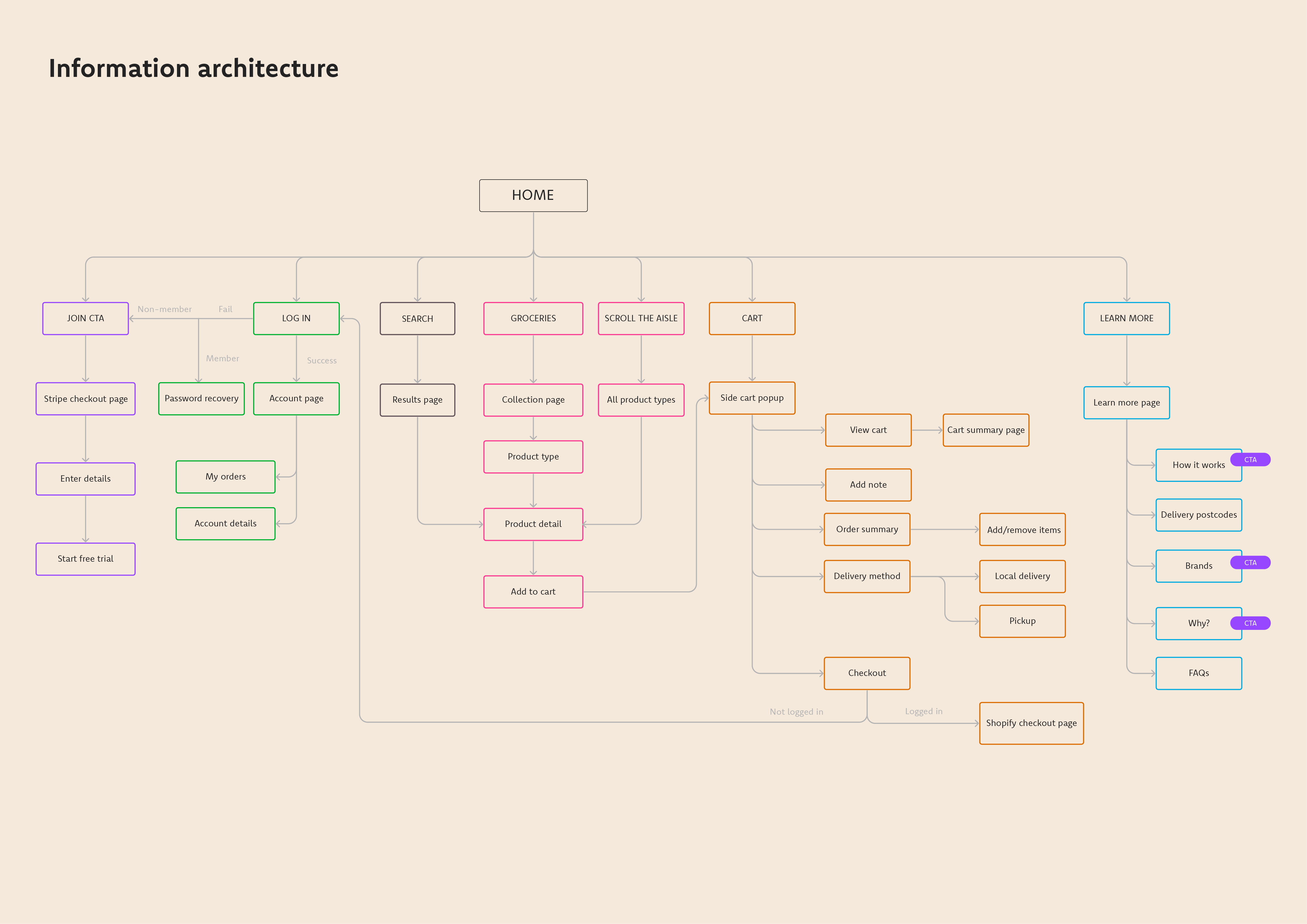
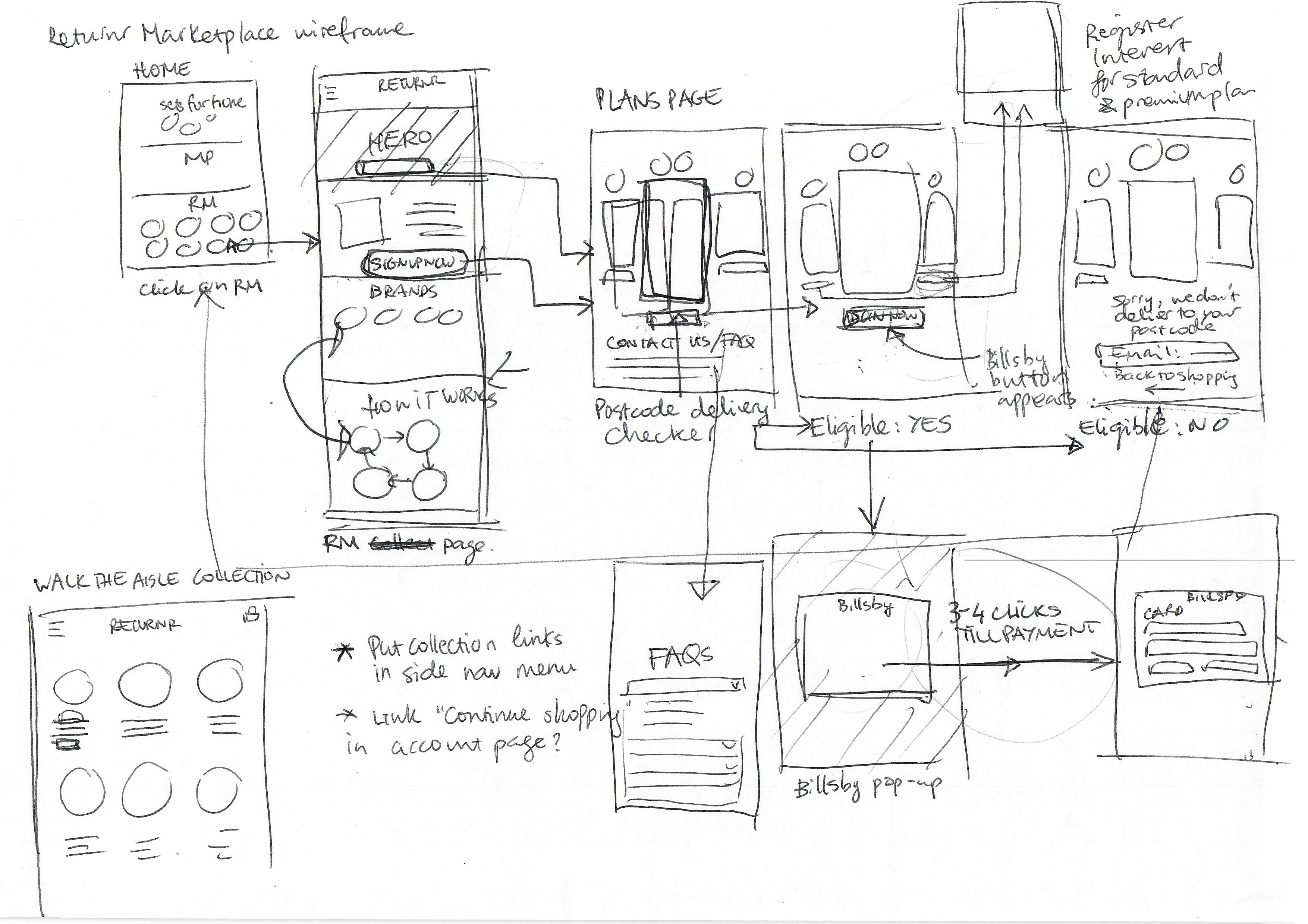
“Thinking” pages: UX flows & wireframes
The wireframes below lay out how customers first land on the website, explore the service, then proceed to sign up. The Shopify back-end uses several apps to manage subscriptions and access. Mapping it out in low fidelity like this helped us see where the custom apps come into play, and whether they’re functioning properly.
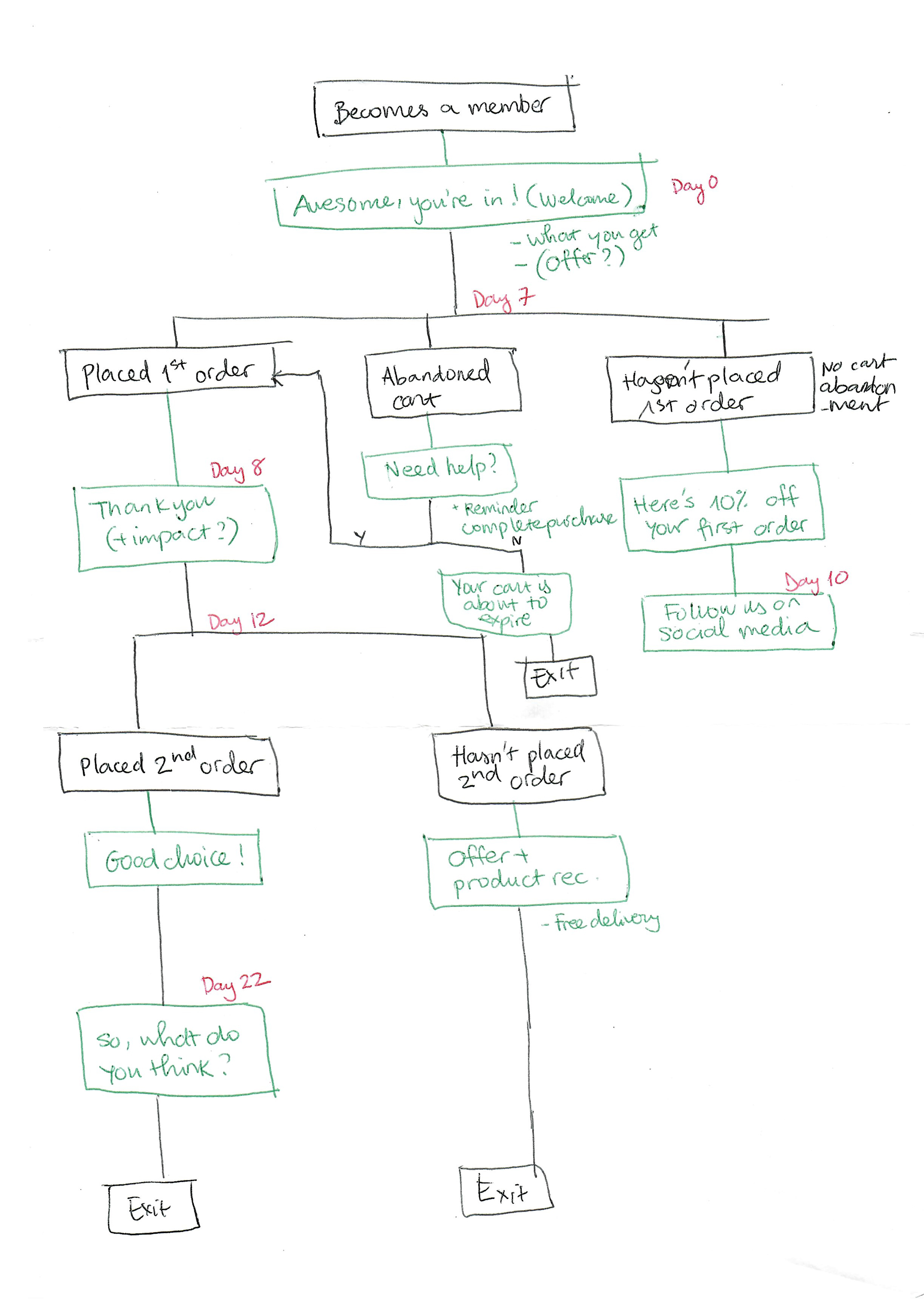
I also mapped out flows for email marketing campaigns, with the sketch below focusing on the first-time customer experience and encouraging them to place their first order.
Shaping the brand through experimentation
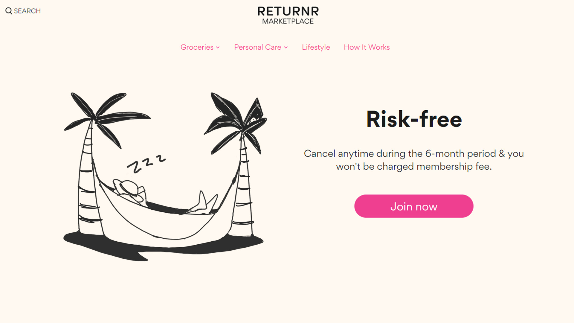
The Returnr Marketplace brand was shaped through iterations of the website, rather than something that already existed. I led the process of exploring visual directions, experimenting with illustrations, photography, colours and messaging.
“How it works” page – feedback from the management team: the “How it works” page needs to be more aspirational by highlight how the customer’s life might be transformed by using the service.
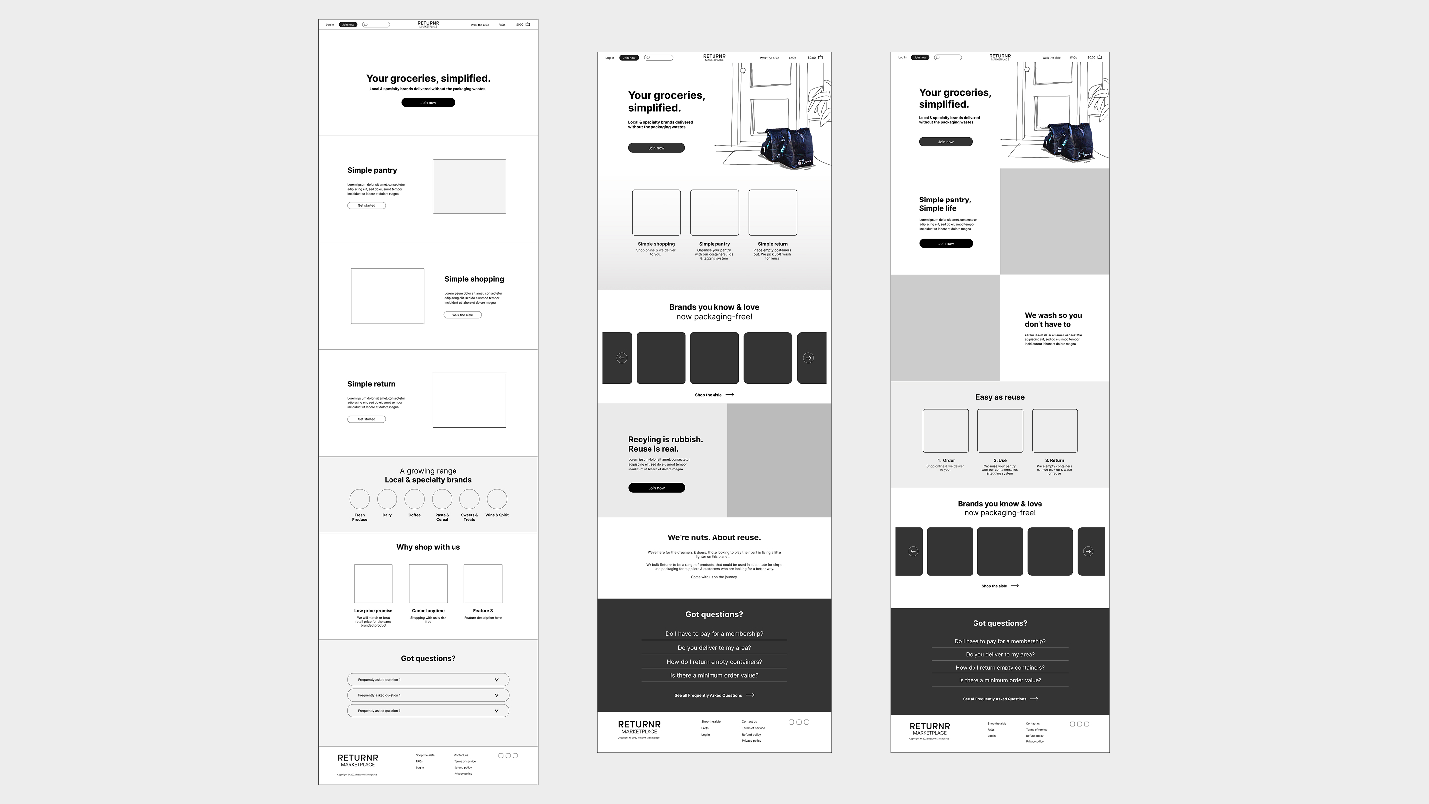
I proposed the concept of “simplicity”, focusing on how we’ve made waste-free grocery shopping effortless for the customer. Here, I shaped both the direction of the copy and visual design. The page layout variations below were presented for internal feedback.
To further create a distinctive brand identity, I experimented with hand-drawn illustrations. The set of illustrations below feature clean bold lines and solid blocks of black in a quirky, playful style.

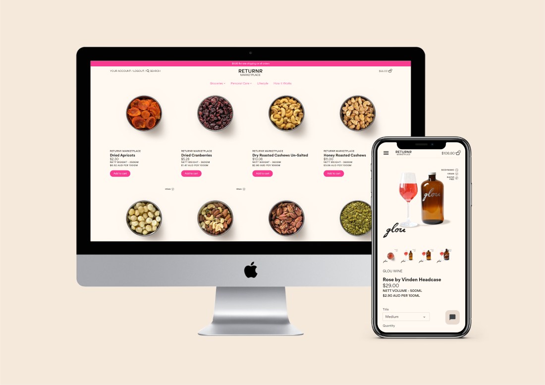
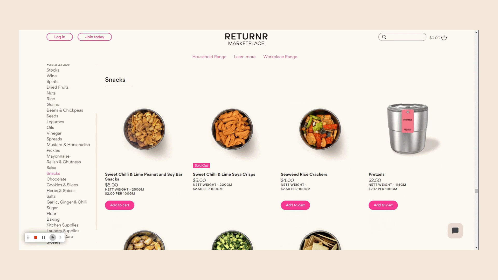
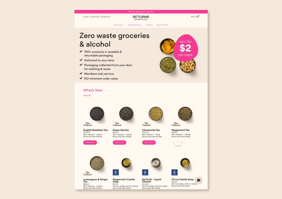
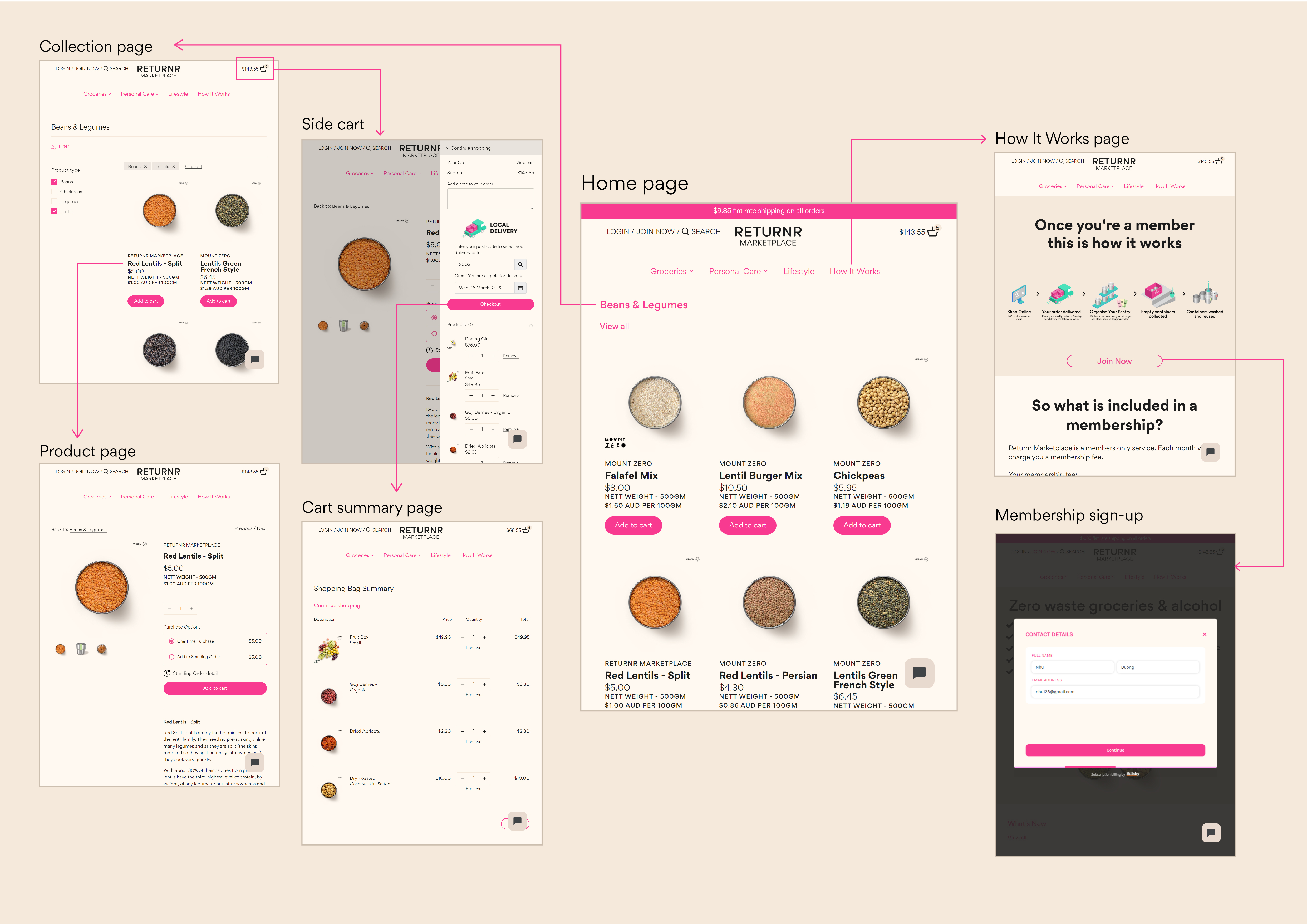
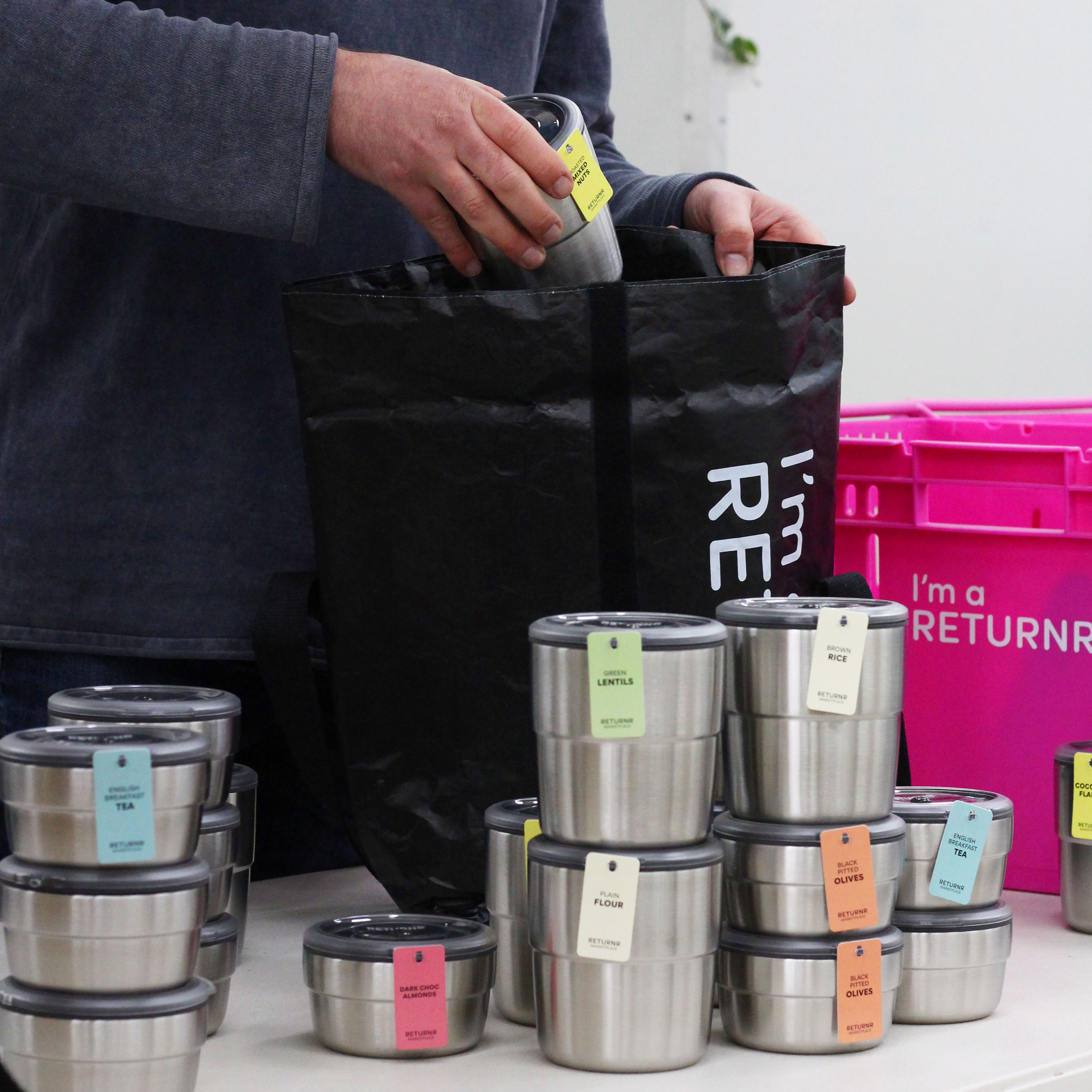
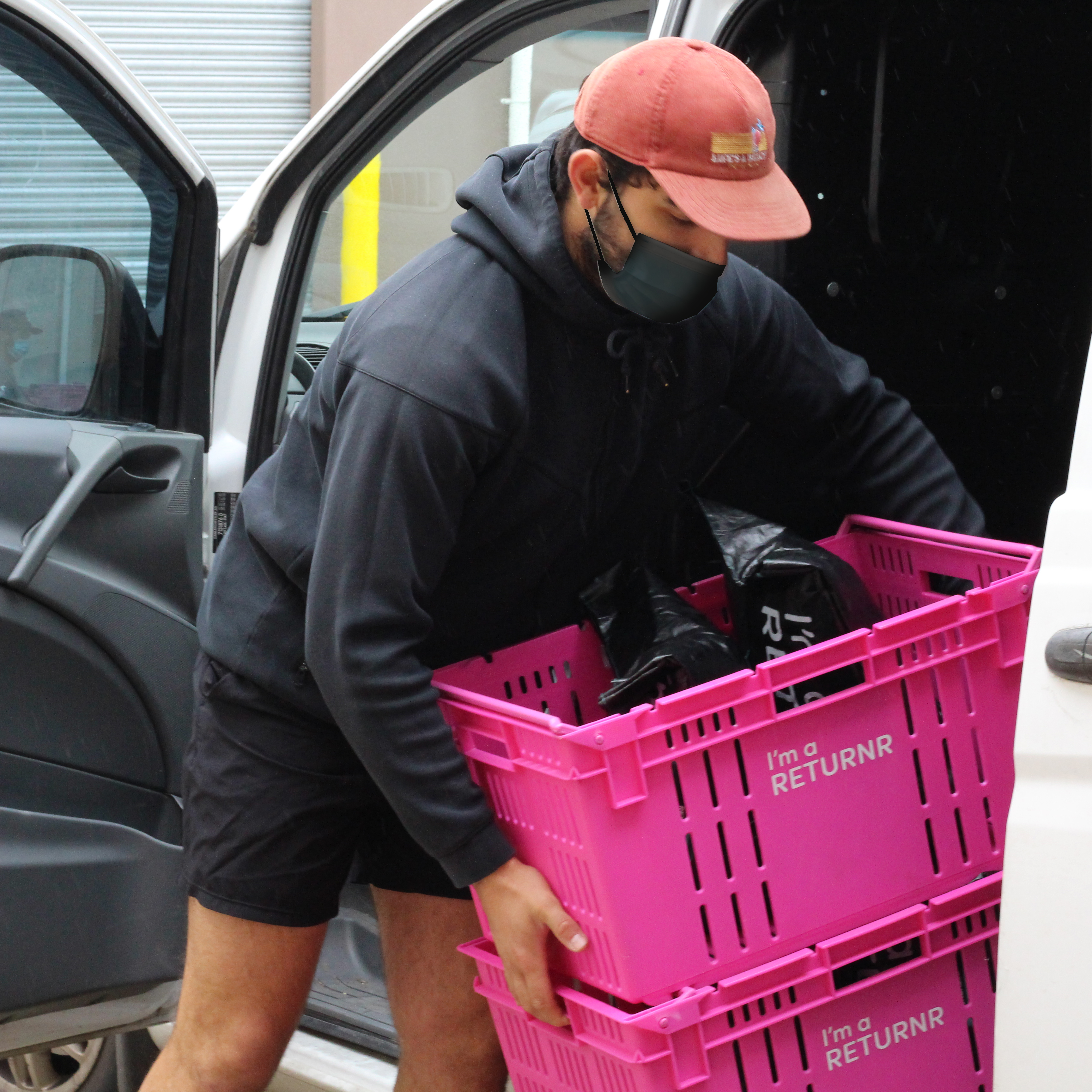
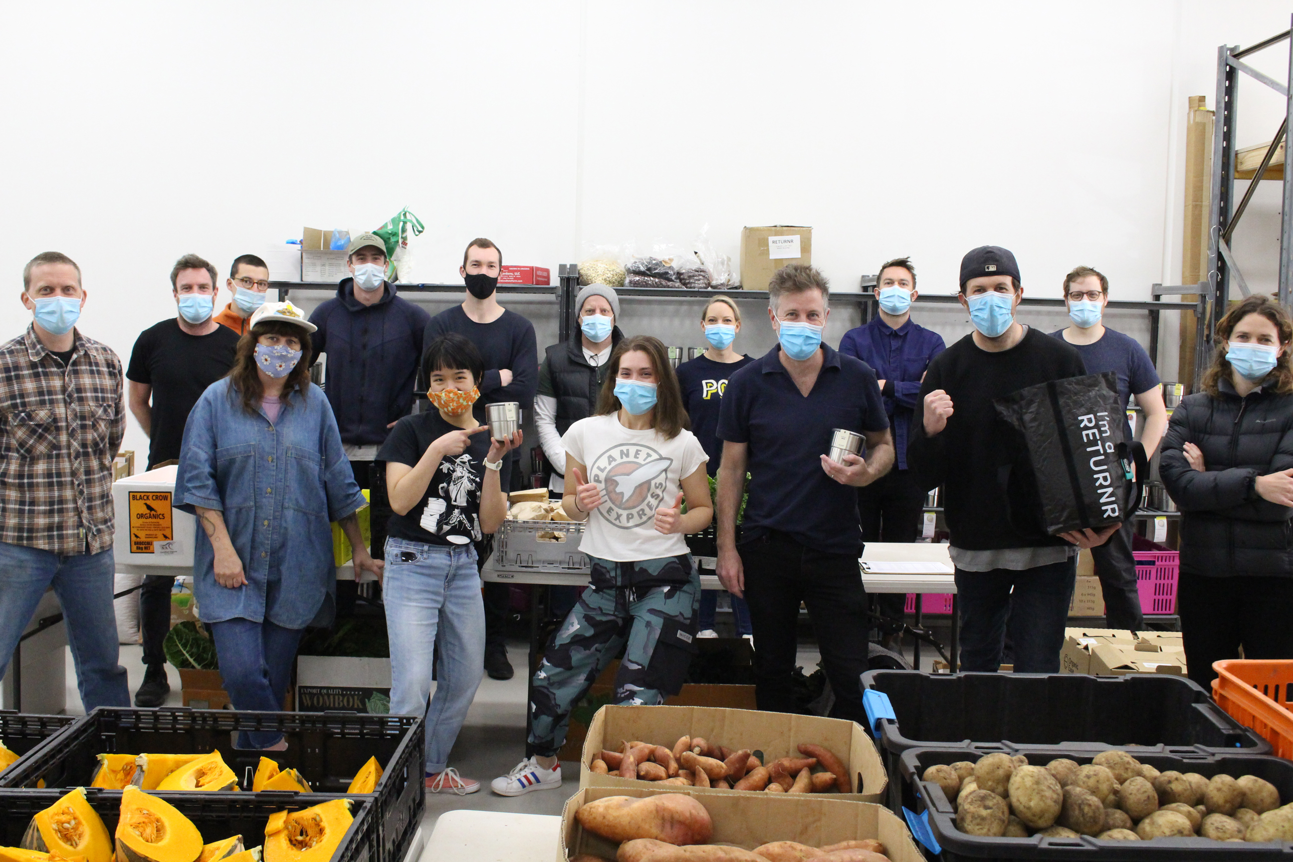
Returnr Marketplace in action
Lessons & reflection
The fast-paced nature of this startup project means that we were constantly building things on the fly. Here are some things I would do differently if I were to do this project again.
Better documentation: I would capture feedback from the team and document the process better. Either by recording the discussions / feedback sessions or implementing collaborative design tools. So that we have better reference point for decision making down the line.
Pushing for user testing & feedback: Most design changes were driven by internal management decisions. I suggested, and in hindsight I could have pushed harder, to gather data from real customers. Even a feedback survey via email or social media would provide valuable insights.
